
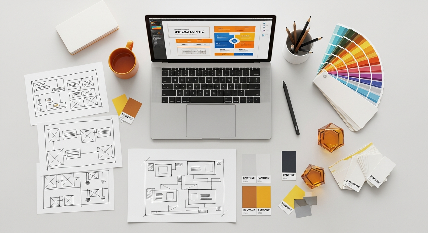
Understanding the Power of Infographics in 2026
Infographics, a portmanteau of “information” and “graphics,” are visual representations of data, knowledge, or ideas intended to present information quickly and clearly. They combine text, images, and data visualizations (like charts and graphs) to tell a story or explain a concept in a compelling way. In an increasingly visual world, the human brain processes images significantly faster than text, making infographics exceptionally effective for communication.
The strategic value of infographics in 2026 cannot be overstated. They serve as powerful assets for content marketing, educational materials, internal communications, and public awareness campaigns. Their ability to simplify intricate subjects, highlight key insights, and maintain audience engagement makes them invaluable. Furthermore, well-designed infographics are inherently shareable, extending their reach across various digital platforms and amplifying your message organically. They transcend language barriers more effectively than plain text, offering a universal appeal that can connect with diverse audiences globally.
Beyond mere aesthetics, infographics play a crucial role in enhancing comprehension and retention. By presenting information in a structured and visually appealing manner, they reduce cognitive load, allowing recipients to grasp complex ideas with greater ease. This makes them particularly effective in fields ranging from scientific research and business reporting to social advocacy and educational outreach. Embracing infographic design is about harnessing the power of visual storytelling to communicate with clarity, impact, and persuasive authority.
Phase 1: Strategic Planning and Data Collection

The foundation of any successful infographic lies in meticulous planning and rigorous data collection. Skipping these initial steps often leads to muddled messages and ineffective visuals. Think of this phase as laying the blueprint for your visual narrative.
Define Your Objective and Audience
Before you even think about colors or charts, ask yourself: What do I want to achieve with this infographic? Is it to educate, persuade, entertain, or raise awareness? A clear objective will dictate your content, tone, and visual approach. For instance, an infographic aimed at converting leads will differ significantly from one explaining a scientific process.
Equally important is understanding your target audience. Who are they? What do they already know (or not know) about the topic? What are their interests, pain points, and preferred communication styles? Tailoring your infographic to your audience ensures relevance and resonance. For a professional audience, you might use more technical language and detailed data visualizations, whereas a general audience would require simpler language and more intuitive graphics. Knowing your audience helps you determine the appropriate level of detail, the type of data to highlight, and the overall aesthetic appeal.
Gather and Verify Your Data
An infographic is only as credible as the data it presents. Always prioritize gathering information from reputable, authoritative sources. This includes academic journals, government reports, industry analyses, and established research institutions. Avoid relying on anecdotal evidence or unverified claims. For internal infographics, ensure your company data is accurate and up-to-date.
Once collected, rigorously verify your data for accuracy and consistency. Cross-reference information from multiple sources where possible. Any discrepancies should be investigated and resolved. Misleading or incorrect data can severely damage your infographic’s credibility and, by extension, your own. Organize your data logically, identifying the key statistics, trends, and facts that directly support your objective and narrative. This preparatory step is crucial for building a trustworthy and impactful visual story.
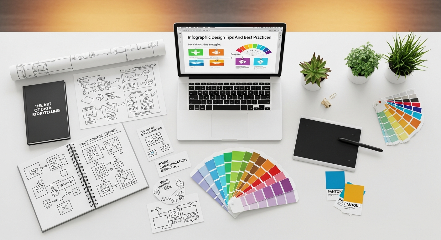
Craft Your Narrative: Storytelling with Data
At its heart, an infographic is a visual story. Raw data, while informative, can be dry. Your task is to transform this data into a compelling narrative that guides the viewer through a logical progression of insights. Start by identifying the core message or “big idea” you want to convey. What is the single most important takeaway? Everything else should support this central theme.
Outline your story arc. What’s the introduction? What are the main points or arguments you want to make? How will you conclude? Consider using a problem-solution structure, a chronological sequence, a comparison, or a hierarchical breakdown. Simplify complex information by breaking it down into smaller, digestible chunks. Use analogies or metaphors if they help clarify difficult concepts. A well-crafted narrative ensures that your infographic flows smoothly, maintaining viewer interest from start to finish and making the information easy to follow and remember.
Phase 2: Core Design Principles for Maximum Impact
Clarity and Simplicity: Less is More
The cardinal rule of infographic design is clarity. An infographic cluttered with too much text, too many colors, or too many visual elements becomes overwhelming and defeats its purpose. The “less is more” philosophy is critical here. Focus on the essential information and eliminate anything that doesn’t directly contribute to your message.
Utilize ample white space (or negative space) to give your design room to breathe and guide the viewer’s eye. Each element should have a clear purpose and sufficient space around it to prevent visual confusion. The goal is for the viewer to grasp the main points quickly, without having to decipher a chaotic visual landscape. This principle directly relates to user experience (UX) design. Just as with digital interfaces, a clear and intuitive layout in an infographic ensures a positive user experience. What Is UX Design And Why It Matters for digital products equally applies to visual communication assets like infographics – users need to easily understand and navigate the information without friction or cognitive overload. A simple, uncluttered design improves comprehension and engagement, making the information more accessible and memorable.
Visual Hierarchy: Guiding the Eye
Visual hierarchy is the arrangement or presentation of elements in a way that implies importance. It dictates the order in which the human eye perceives what it sees. In an infographic, a strong visual hierarchy ensures that viewers effortlessly follow your intended narrative path and absorb the most critical information first.
You can establish hierarchy through various design elements:
- Size: Larger elements naturally draw more attention. Use larger fonts for titles and key statistics.
- Color and Contrast: Bright, contrasting colors can highlight important sections or data points. Muted tones can be used for secondary information.
- Placement: Elements placed at the top or center of the infographic often receive immediate attention. Strategic placement guides the eye through the flow of information.
- Typography: Varying font weights (bold, light), styles (serif, sans-serif), and sizes helps differentiate between headings, subheadings, and body text.
- Grouping: Use proximity and visual containers (like boxes or lines) to group related information, making it easier for the viewer to process chunks of data.
A well-executed visual hierarchy creates a natural flow, making complex data feel organized and easy to navigate.
Color Theory and Typography: Setting the Mood and Readability
Colors evoke emotions and can significantly impact how your infographic is perceived. Choose a color palette that aligns with your brand, your message, and your audience. Limit your primary color palette to 2-4 main colors to maintain consistency and avoid visual chaos. Use accent colors judiciously to highlight key data points or calls to action. Be mindful of color psychology (e.g., blue for trustworthiness, green for growth) and ensure sufficient contrast, especially between text and background, for optimal readability.
Typography is equally crucial. Select fonts that are legible, professional, and consistent with your brand identity. Generally, use sans-serif fonts for digital infographics as they tend to be easier to read on screens. Limit yourself to 2-3 font families at most: one for headings, one for body text, and potentially an accent font. Ensure appropriate font sizes and line spacing to prevent eye strain. Headings should be clearly distinguishable from body text, and captions should be readable but not overpower the main content. The right combination of color and typography can elevate your infographic from merely informative to truly captivating.
Iconography and Imagery: Enhancing Understanding
Icons and imagery are powerful tools for visual storytelling in infographics. They can break up text, represent complex ideas simply, and add visual interest. When selecting icons, ensure they are consistent in style (e.g., flat, line, glyph) and size. They should be immediately recognizable and reinforce the message, not distract from it.
Use images sparingly and strategically. High-quality, relevant photographs or illustrations can add impact, but ensure they don’t overshadow your data. Imagery should complement your information, providing context or an emotional connection where appropriate. Avoid stock photos that feel generic or unrelated to your content. Custom illustrations can add a unique and professional touch. The effective use of iconography and imagery helps convey information more quickly and makes the infographic more engaging and memorable.
Phase 3: Data Visualization Best Practices

The heart of an infographic often lies in its data visualizations. Presenting data clearly, accurately, and compellingly is vital for effective communication.
Choosing the Right Chart or Graph
Not all data visualizations are created equal, and selecting the appropriate chart type for your data is critical. Using the wrong chart can mislead your audience or obscure your insights.
- Bar Charts: Excellent for comparing discrete categories or showing changes over time.
- Line Graphs: Ideal for displaying trends over continuous periods.
- Pie Charts/Donut Charts: Best for showing parts of a whole (though often criticized for being hard to compare segments; consider bar charts for multiple comparisons).
- Scatter Plots: Useful for showing relationships or correlations between two variables.
- Area Charts: Similar to line graphs but show volume or magnitude over time.
- Treemaps: Good for displaying hierarchical data and proportions within categories.
- Geographic Maps: Effective for visualizing location-based data.
Always consider the type of data you have (categorical, numerical, temporal, spatial) and the relationship you want to highlight. Simplicity and directness should guide your choice. Avoid overly complex 3D charts or novel visualizations that might confuse your audience rather than enlighten them.
Accuracy and Avoiding Misrepresentation
Ethical data visualization is non-negotiable. Your charts and graphs must accurately represent the data. Common pitfalls to avoid include:
- Truncated Axes: Starting a y-axis at a value other than zero can exaggerate differences. While sometimes justifiable in scientific contexts, it can be highly misleading in general infographics if not clearly indicated.
- Manipulating Scales: Distorting the scale of an axis to make a trend appear more dramatic than it is.
- Using Inappropriate Chart Types: For example, using a pie chart for data that doesn’t sum to 100%.
- Omitting Data: Selectively presenting data points to support a particular agenda while ignoring contradictory information.
- Misleading Visuals: Using disproportionate icons or imagery to represent quantities, where the area of the visual doesn’t accurately reflect the value it represents.
Always ensure your data visualizations are transparent, unbiased, and designed to convey truth rather than spin. Double-check all calculations and ensure labels correspond precisely to the data points. Maintain integrity in your presentation to build and maintain trust with your audience.
Adding Context and Annotations
Raw charts, no matter how well-chosen, often lack sufficient context to be fully understood on their own. Effective infographics integrate clear titles, labels, legends, and source citations to make the data self-explanatory.
- Clear Titles: Every chart should have a concise, descriptive title that immediately tells the viewer what they are looking at.
- Axis Labels: Label both X and Y axes clearly, including units of measurement.
- Legends: If using multiple data series or categories, provide a legend that explains what each color or pattern represents.
- Data Labels: Consider adding direct data labels to bars or points if it enhances readability without cluttering the visual.
- Annotations and Callouts: Use arrows, circles, or brief text boxes to highlight specific data points, trends, or outliers, offering additional insights or explanations.
- Sources: Always cite your data sources clearly and conspicuously, typically at the bottom of the infographic. This adds credibility and allows interested viewers to investigate further.
Providing ample context ensures that your audience can fully understand the meaning and significance of the data presented without needing external information.
Phase 4: Refinement, Distribution, and Performance
Creating the infographic is only half the battle. To ensure its maximum impact, you need to refine it, distribute it effectively, and learn from its performance.
Feedback and Iteration: The Heuristic Approach
Even the most experienced designers can overlook flaws in their own work. Before finalizing your infographic, solicit feedback from others. Ask colleagues, friends, or a target audience member to review it for clarity, accuracy, and overall impact. Pay attention to questions they ask or points of confusion they raise.
Just as you would with a website or an application, conducting a heuristic evaluation for your infographic can reveal usability issues or areas for improvement. How To Conduct A Heuristic Evaluation involves assessing elements against established principles (e.g., visibility of system status, match between system and the real world, consistency and standards, error prevention, aesthetic and minimalist design). For an infographic, this translates to evaluating if the information hierarchy is clear, if the data is easily understandable, if colors and fonts contribute to readability, and if the overall design is intuitive. This systematic review helps identify weaknesses in design, content flow, or data presentation before the infographic goes live. Be open to constructive criticism and be prepared to iterate on your design based on the feedback received. This iterative process is crucial for polishing your infographic into a highly effective communication tool.
Accessibility Considerations
Designing for accessibility ensures that your infographic can be understood and appreciated by the widest possible audience, including individuals with disabilities. This is not just good practice but often a legal requirement in 2026.
- Color Contrast: Ensure high contrast between text and background colors, as well as between different elements in your charts, to assist individuals with color blindness or low vision. Use tools to check contrast ratios.
- Alt Text for Images: For infographics embedded online, provide descriptive alt text for the entire image. This allows screen readers to convey the infographic’s main message to visually impaired users.
- Text Alternatives: For highly complex infographics, consider providing a text-based summary or transcript that conveys all the information presented visually.
- Logical Reading Order: Ensure the flow of information is logical for screen readers if the infographic is broken into multiple accessible elements.
- Clear Typography: Use legible fonts and adequate font sizes, avoiding overly decorative or small text.
Prioritizing accessibility makes your content inclusive and demonstrates a commitment to reaching everyone.
Optimizing for Distribution Channels
An infographic’s effectiveness is also determined by its reach. Tailor your infographic for the specific platforms where it will be shared.
- Website/Blog: Provide a high-resolution version for embedding. Consider an embed code for easy sharing.
- Social Media: This ties directly into a Social Media Graphics Design Guide. Infographics designed for social media need to be optimized for quick consumption and platform-specific dimensions to maximize reach and engagement. For platforms like Instagram, you might need to break a long infographic into a carousel of square images. For X (formerly Twitter) or Facebook, a shorter, wider format might be more effective. LinkedIn often prefers more professional, detailed visuals. Always ensure file sizes are optimized for fast loading.
- Email: Embed a smaller, click-through image that links to the full infographic on your website, or include a direct download link for a PDF version.
- Print: If printing, ensure high resolution (300 DPI), use CMYK color mode, and consider bleed areas.
Using appropriate file formats (e.g., PNG for transparency, JPEG for photos, SVG for scalability on web) and optimizing file size without sacrificing quality are critical for quick loading times and a smooth user experience across all platforms.
Tracking Performance and Learning
The work isn’t over once your infographic is published. To truly understand its impact and inform future designs, you need to track its performance.
- Website Analytics: Monitor page views, time on page, and bounce rate for the page hosting your infographic.
- Social Media Engagement: Track likes, shares, comments, and saves across platforms.
- Backlinks: See if other websites are linking to your infographic, indicating its value and potential for SEO.
- Conversions: If your infographic has a call to action, track how many users complete it.
Analyzing these metrics provides valuable insights into what resonates with your audience, which platforms are most effective for distribution, and what design elements contribute to success. This data-driven approach allows for continuous improvement, making each subsequent infographic even more effective.
Tools and Resources for Infographic Creation in 2026
The landscape of design tools in 2026 offers a wide array of options for creating infographics, catering to various skill levels and budgets. For beginners and those needing quick, professional results, platforms like Canva, Piktochart, and Infogram provide intuitive drag-and-drop interfaces with extensive libraries of templates, icons, and stock photos. These tools are excellent for getting started without a steep learning curve.
For designers seeking greater creative control and customization, professional software suites such as Adobe Illustrator, Adobe InDesign, and Figma remain the industry standard. These tools offer unparalleled precision, advanced vector graphics capabilities, and the flexibility to create unique, bespoke designs from scratch. Many advanced users also leverage data visualization libraries in programming languages like Python (with libraries like Matplotlib or Seaborn) or R (with ggplot2) to generate highly specific and dynamic charts, which can then be refined in design software.
Beyond software, numerous online resources offer inspiration, tutorials, and free assets. Websites like Behance and Dribbble showcase incredible infographic portfolios from designers worldwide. Design blogs, online courses, and specialized communities provide ongoing learning opportunities to hone your skills. Remember, the tool is only as good as the hand that wields it. Consistent practice, a keen eye for detail, and a commitment to applying the best practices discussed in this guide will ultimately determine the quality and impact of your infographics in 2026 and beyond.
Frequently Asked Questions About Infographic Design
What is the ideal length for an infographic?
The ideal length for an infographic varies depending on its complexity, the amount of information it needs to convey, and its intended distribution channel. Generally, infographics designed for web embedding tend to be longer, allowing for a deep dive into a topic, often scrolled vertically. Social media infographics, however, need to be much shorter and more concise to grab attention quickly in a fast-paced feed. As a rule of thumb, aim for a length that allows you to tell your complete story without unnecessary fluff. For web, this could be anywhere from 600 to 2,000 pixels wide and 3,000 to 8,000 pixels long. The key is to maintain a balance between providing sufficient detail and preventing visual fatigue. If your information requires excessive scrolling, consider breaking it into multiple, related infographics or a series.
How do I make my infographic accessible?
Making your infographic accessible involves several key practices. Firstly, ensure high contrast between text and background colors, and between different data visualization elements, to assist users with visual impairments or color blindness. Use legible fonts with adequate sizing and line spacing. Provide comprehensive alt text for the entire infographic image when embedding it online, describing its main message and key takeaways for screen reader users. For very data-dense or complex infographics, consider offering a text-based transcript or summary of the information presented visually. Organize your content with a clear, logical flow that is easy for screen readers to interpret. Finally, avoid relying solely on color to convey meaning; use patterns, labels, or different textures to differentiate data points.
Can infographics improve SEO?
Yes, infographics can significantly improve your search engine optimization (SEO) strategy. When designed well and distributed effectively, infographics can attract high-quality backlinks from other websites that embed or reference your visual content. Backlinks are a crucial ranking factor for search engines. Furthermore, infographics can increase engagement on your website and social media channels, leading to longer dwell times and more shares, which signals to search engines that your content is valuable and relevant. To maximize SEO benefits, always embed your infographic with a descriptive title and alt text, include a keyword-rich introduction and conclusion on the hosting page, and provide an embed code for easy sharing. Optimizing the file name and providing a text summary can also boost discoverability.
What’s the difference between an infographic and a data visualization?
While often used interchangeably, there’s a subtle but important distinction. A data visualization is a specific graphical representation of data, such as a bar chart, line graph, or scatter plot, focusing solely on presenting numerical information clearly and accurately. An infographic, on the other hand, is a broader communication tool that uses a combination of data visualizations, text, icons, illustrations, and other graphic elements to tell a complete story or explain a complex concept. Data visualizations are components within an infographic. An infographic integrates multiple data visualizations, alongside narrative text and design elements, to provide context, interpretation, and a cohesive message. Think of it this way: all infographics contain data visualizations, but not all data visualizations are infographics.
How often should I create new infographics?
The frequency of creating new infographics depends entirely on your content strategy, resource availability, and the needs of your audience. There’s no universal “right” answer. For some businesses, producing one high-quality infographic per quarter might be sufficient to cover a significant topic and support marketing campaigns. Others with a rapid content cadence or a strong focus on data-driven storytelling might aim for monthly or even bi-weekly infographics. The key is to prioritize quality over quantity. A well-researched, beautifully designed, and highly shareable infographic will always outperform several mediocre ones. Focus on creating infographics when you have compelling data, a clear story to tell, and the resources to execute it effectively, ensuring each piece adds significant value to your content library.
What are common mistakes to avoid in infographic design?
Several common mistakes can undermine an infographic’s effectiveness. Firstly, avoid visual clutter: too much information, too many colors, or excessive graphics can overwhelm the viewer. Secondly, steer clear of poor data visualization choices, such as using the wrong chart type for your data or manipulating axes to misrepresent findings. Thirdly, ensure readability by choosing legible fonts, adequate font sizes, and sufficient color contrast. Fourthly, don’t neglect your narrative; an infographic without a clear story or logical flow will confuse rather than inform. Lastly, always cite your sources to maintain credibility, and proofread meticulously for any factual or grammatical errors. Overlooking these details can significantly detract from your infographic’s professional appearance and impact.
Recommended Resources
You might also enjoy Cybersecurity Tips For Remote Workers from Bookmark Sharer.
You might also enjoy How To Create A Landing Page That Converts from Eamped.